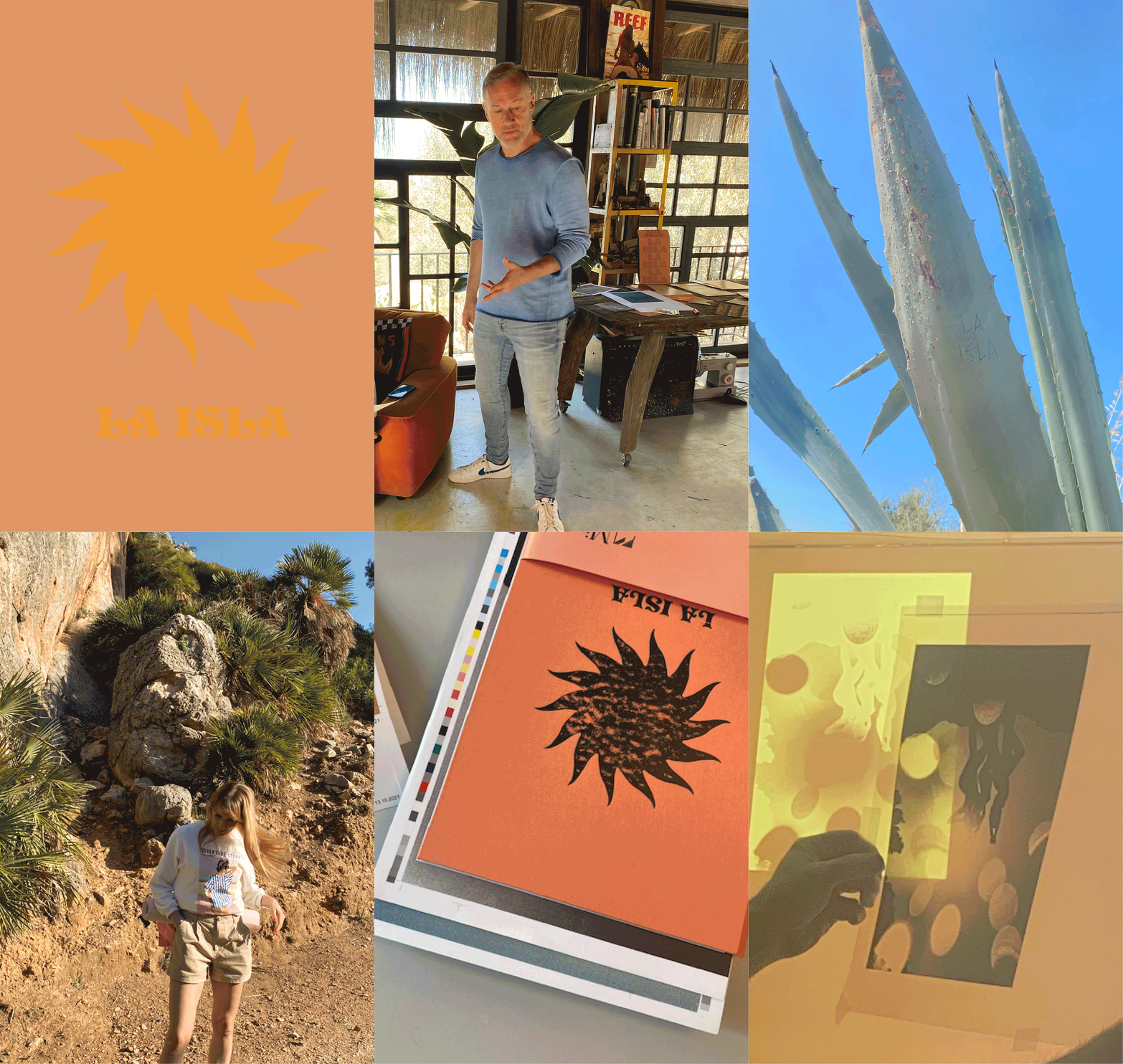
La Isla.
Islas Baleares
Febr.-Nov. 2021
INTERVIEW
Frank Rocholl
Creative Director
Mirage Co-Founder

How did the „La Isla“ collaboration occur?
I got in touch with Kate by pure accident because she ordered the latest Mirage book to an address in Soller/Mallorca, Spain. Fact which surprised me because I had assumed her location in Berlin or London. I really liked her photography, especially the underwater stuff, so I thought, next time I would be on the island I would get in touch. I actually did which lead to a meeting with her in her nice mountain home above Soller.
And then?
We talked a lot about the dreamy and magical side of Mallorca, exchanged our views on favorite places. To me, Mallorca is always a great mental detox, cleansing my head from all the digital distractions and information overloads of the city. Kate’s last book „Amor“ was kind of a greatest hits compilation of her more „wilder“ work of the past ten years, so after seeing all her new shootings done in Mallorca, I suggested for us to do her follow-up book together. Though it would be conceptualized more like an object, briefed by the transcendental spirit of the Island. That became „La Isla“.
Why have you been into it?
I like creating small monothematic things. Coffee table objects to dream yourself away. Kate liked the Mirage books for their sophisticated qualities. We both felt it would be a good fit to collaborate.
What came next?
Kate gave me a lot of photo material. I did a first edit and a lot of cover proposals with various font tests to catch the spirit. But it was all a bit too cliché vintage or too classically photobook, which is a genre in itself. Kate is strongly influenced by Mexican Iconography, through her Mexican husband I guess. Her house and studio are full of colorful snake or jumping jaguar illustrations. I would even say that her island photography is seen through a Mexican influenced point of view. The palm trees, the cactuses, the rocks. So we ended up with a fitting sun illustration and two psychedelic fonts.
What was the procedure of the edit?
I went to Soller to meet with Kate after a first rough structure was visible on screen. Then we printed everything out and started editing the whole thing on the floor in her studio which to me is the fastest / most practical way of doing it. You get a quick overview of the flow. Then we exchanged and exchanged and exchanged images. On the surface, it‘s a morning to night story, while we have a few different color centers as well. Beige, Orange, intense Blue and Green. Essentially, it feels like a magical, carefree nude paradise by the sea, illuminated by the mediterranean sun. Civilization is far, far away.
What was the set-up like?
Kate’s house is surrounded by a vivid scene, lots of Creatives live close by, it feels a bit like an artist community. I saw Mario Sorrenti who is one of Kate’s neighbors, a few times dressed like a complete Parisien in the middle of wild nature, walking his dog which was a cool picture in that setup. That whole area close to Deia offers endless ocean views and the most beautiful sunsets. So, working on Kate’s terrace with that view feels like a perfect match to the subject matter.
